Building a Macro Dashboard Spreadsheet
Why Build a Macro Dashboard
Tracking economic indicators requires a systematic approach. A well-designed dashboard helps you:
- Monitor data as it releases
- Track trends over time
- Identify divergences between indicators
- Form a coherent economic view
The point is: Without a tracking system, you react to headlines. With a dashboard, you interpret data in context.
Core Indicators to Track
A practical dashboard focuses on indicators that matter most:
Tier 1 (Essential):
| Indicator | Release Frequency | Primary Source |
|---|---|---|
| Nonfarm payrolls | Monthly | BLS |
| Unemployment rate | Monthly | BLS |
| CPI inflation | Monthly | BLS |
| Core PCE inflation | Monthly | BEA |
| GDP growth | Quarterly | BEA |
| ISM Manufacturing | Monthly | ISM |
| ISM Services | Monthly | ISM |
Tier 2 (Important):
| Indicator | Release Frequency | Primary Source |
|---|---|---|
| Initial jobless claims | Weekly | DOL |
| Retail sales (control group) | Monthly | Census |
| Housing starts | Monthly | Census |
| Core capital goods orders | Monthly | Census |
| Consumer confidence | Monthly | Conference Board |
Tier 3 (Supplemental):
- Financial conditions indexes
- Regional Fed surveys
- Capacity utilization
- Earnings estimates
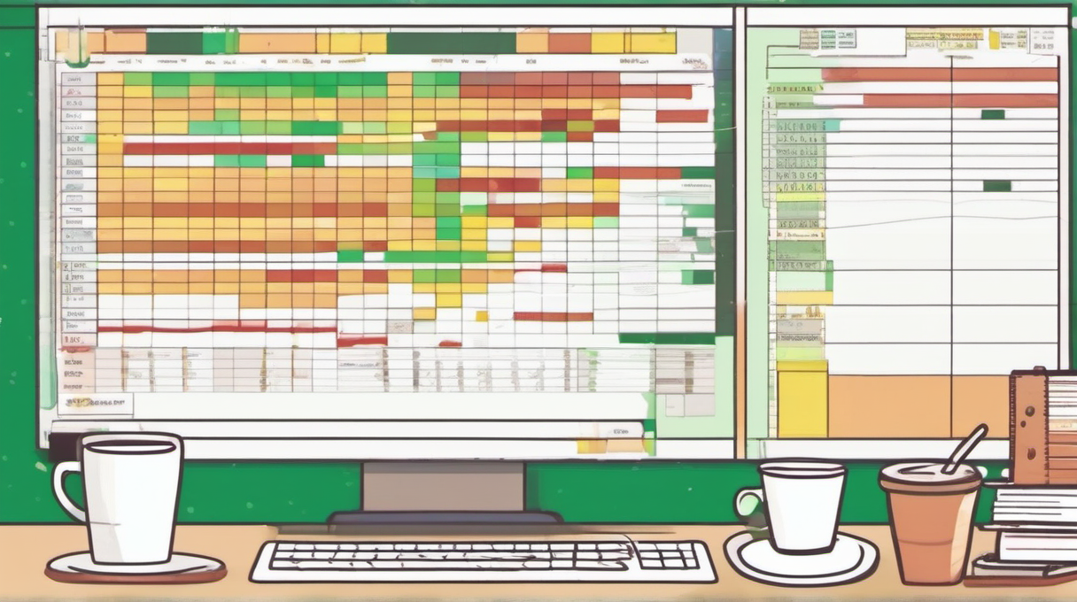
Dashboard Structure
Column layout:
| Column | Content |
|---|---|
| A | Indicator name |
| B | Category (Employment, Inflation, etc.) |
| C | Release date |
| D | Prior reading |
| E | Consensus estimate |
| F | Actual reading |
| G | Surprise (Actual - Consensus) |
| H | 3-month trend |
| I | Year-over-year change |
| J | Notes |
Worked example row:
| Indicator | Category | Release | Prior | Consensus | Actual | Surprise | 3mo Trend | YoY | Notes |
|---|---|---|---|---|---|---|---|---|---|
| Nonfarm Payrolls | Employment | Nov 1 | +223K | +125K | +12K | -113K | Slowing | N/A | Hurricanes, strikes |
Data Sources
Free official sources:
- FRED (Federal Reserve Economic Data): fred.stlouisfed.org
- BLS Data Viewer: data.bls.gov
- BEA Interactive Tables: apps.bea.gov
- Census Economic Indicators: census.gov/economic-indicators
Free private sources:
- Trading Economics (summary data)
- Investing.com (calendar and data)
- Bloomberg Economic Calendar (requires free account)
Premium sources:
- Bloomberg Terminal
- Refinitiv
- Haver Analytics
Release Calendar Integration
Build a calendar tab showing upcoming releases:
Weekly rhythm:
- Monday: Empire State (mid-month)
- Tuesday: Housing starts (mid-month), Consumer Confidence (late month)
- Wednesday: Durable goods (late month)
- Thursday: Initial claims (weekly), Philly Fed (mid-month)
- Friday: Employment report (first Friday), GDP (end of quarter months)
The practical point: Knowing what releases when helps you prepare. Set alerts for high-impact releases.
Calculating Trend Signals
Three-month moving average: For monthly data, calculate: (Current + Prior 1 + Prior 2) / 3
Trend direction:
- Rising: Current 3mo avg > Prior 3mo avg
- Falling: Current 3mo avg < Prior 3mo avg
- Stable: Change < 5% of prior level
Year-over-year change: YoY % = (Current / Same month last year - 1) x 100
Building a Summary View
Create a summary tab with traffic-light signals:
| Category | Overall Signal | Key Concern |
|---|---|---|
| Employment | Green | None |
| Inflation | Yellow | Core PCE above target |
| Growth | Green | None |
| Housing | Yellow | Starts declining |
| Manufacturing | Red | ISM below 50 |
Signal criteria:
- Green: Expanding, improving, or on target
- Yellow: Mixed signals or modest concern
- Red: Contracting, deteriorating, or significantly off-target
Common Mistakes in Dashboard Design
- Tracking too many indicators: Information overload defeats the purpose
- Ignoring consensus expectations: Surprises move markets, not levels
- Forgetting to update: Stale data leads to stale analysis
- Missing revisions: Prior month revisions often matter as much as current month
- Overcomplicating visualization: Simple is better than fancy
Interpreting Across Categories
Use cross-category analysis:
Confirming signals:
- Employment strong + Retail sales strong = Consumer health confirmed
- ISM Manufacturing weak + Durable goods weak = Industrial weakness confirmed
Conflicting signals:
- Employment strong + Consumer confidence weak = Watch for labor market turn
- Inflation falling + Wages rising = Margin pressure for companies
The key insight: Look for preponderance of evidence. When 3-4 indicators point the same direction, confidence is high.
Automation Options
Excel/Google Sheets:
- FRED add-in for Excel (free)
- Google Finance functions for basic data
- Manual updates from official releases
Python/R:
- FRED API (free with registration)
- Pandas datareader package
- Automated scripts with scheduled runs
Low-code tools:
- Notion databases with manual updates
- Airtable with data imports
Weekly Workflow
Monday:
- Review prior week's data
- Update any revised figures
- Check upcoming release calendar
Release days:
- Update dashboard within 1 hour of release
- Note surprises and initial market reaction
- Add context notes (distortions, one-time factors)
Friday:
- Weekly summary assessment
- Update trend signals
- Prepare for following week's releases
Checklist for Dashboard Maintenance
Each release:
- Enter actual reading
- Calculate surprise vs. consensus
- Update prior months for revisions
- Add context notes if relevant
Weekly:
- Recalculate 3-month averages
- Update trend signals
- Review cross-category patterns
- Update summary view
Monthly:
- Check data source links still work
- Review indicator weights and relevance
- Archive old data to maintain performance
Next Step
Start with a minimal dashboard tracking only Tier 1 indicators. Use FRED for data access—it is free, reliable, and covers all major economic series. After maintaining the dashboard for one quarter, assess which additional indicators would improve your analysis and add them incrementally.
Related Articles

Corporate Earnings as Macro Data
Every quarter, roughly 400 S&P 500 companies report results within a six-week window, and the aggregate picture they paint is one of the most actionable macro signals available. In Q4 2025, blended...

Inventory-to-Sales Ratios
Understanding how inventory-to-sales ratios signal economic turning points, including sector-specific thresholds and interpretation guidelines.

Currency Pegs vs. Floating Regimes
Compare fixed and floating exchange rate systems, understand reserve requirements, and identify devaluation risks for emerging market investing.